In web development, tabindexes and z-indexes are used for completely different purposes; however, these two attributes can still conflict each other in special scenarios.
The tabindex is a global attribute that is a necessity for accessibility. This attribute determines whether an element can be focused, and whether a user can focus upon the element when using keyboard navigation.
The basic rule of thumb is to use a tabindex of ‘-1’ when an element should be focusable, but not reachable via keyboard navigation; and a tabindex of ‘0’ when an element should be focusable and reachable.
For example with the following code:
<div tabindex="0">A</div>
<div tabindex="-1">B</div>
<div>C</div>
<div tabindex="0">D</div>
<div tabindex="-1">E</div>
<div class="block">F</div>
We would have the following behaviour:
 Focusable elements are outlined with dark borders, tab order is indicated by the numbered circles
In this scenario, the divs with tabindexes defined: A, B, D, E; are focusable (such as by mouse click) as shown with thick borders in the diagram. However, if the user simply navigates through the divs by pressing the tab key on their keyboard, then only the divs with tabindexes of at least zero, A and D, will be focused in the order in which they are written.
The developer also has the ability to order the elements that are to be reached via keyboard navigation by using tab indexes greater than zero:
<div tabindex="2">A</div>
<div tabindex="1">B</div>
<div tabindex="3">C</div>
This example would yield to a keyboard navigation order of the following:
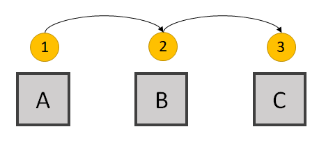
 Tab order is indicated by the numbered circles
In this case, the div with the smallest tabindex, B, would be reached first. Then, the div with the second smallest tabindex, A, would be reached; followed by the div with the next smallest tabindex, C.
This convention is dangerous programming! As mentioned in Mozilla’s web docs, the use of tabindexes greater than zero increases the difficulty for users who rely on assistive technology. Furthermore, if an application becomes very complex, then it will very difficult for the developer to maintain such an assortment of tabindexes. Thus this approach is highly reprimanded.
If one wishes to implement a certain tab order for their elements, they should simply define these elements in the order in which the elements should be reached via keyboard navigation.
For example, if one uses the following logic:
<div tabindex="0">A</div>
<div tabindex="0">B</div>
<div tabindex="0">C</div>
Then the tab order will follow that of the DOM element order where B follows A, and C follows B:

Conclusion: To define tab orders for elements, simply order the elements in the DOM using the same order while using tab indexes of ‘0’ for these elements.
The z-index is a CSS property that allows the developer to position elements on top of one-another in the z-direction.
For example, with two absolutely positioned elements:
<div style="z-index: 2; background-color: red;" class="block">A</div>
<div style="z-index: 1; background-color: blue; margin: 10px 0 0 10px;" class="block">B</div>
We can force one div to appear on top of another by using different z-indexes:

In this case, div A has a greater z-index than div B; thus A appears on top of B.
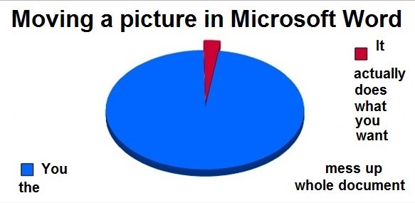
Although z-indexes have been supported by all common web browsers for years, they are still very dangerous to use when an application becomes too complex. Eventually, every time a new component is assigned a new z-index, the developer has to deal with ensuring that every other component rendered on the same page will not be affected. Otherwise, the developer will basically destroy their page with incorrect orders of components, similar to how one can completely cause chaos when dragging one item in a Microsoft Word document.
 I think everyone can relate to this…
Therefore, it is best to avoid using z-indexes of possible.
If a developer wishes to properly position elements in the z-direction without using the z-index attribute, they can define the order of these elements by the order in which they are defined in the DOM. Specifically, elements are positioned higher in the z-direction when they are defined later in the DOM structure.
Therefore, if we take the previous example and remove the z-index attributes, we can order these elements in our HTML code to order these elements in the z-index.
For example, if we wish to render A on top of B, as we did in the previous example, we simply define A AFTER B:
<div style="background-color: blue; margin: 10px 0 0 10px;" class="block">B</div>
<div style="background-color: red;" class="block">A</div>
Otherwise, if we define A before B, then B will be the latest defined element, and will appear on top of A:
<div style="background-color: red;" class="block">A</div>
<div style="background-color: blue; margin: 10px 0 0 10px;" class="block">B</div>

Conclusion: To place elements on top of one-another in the z-direction, define these elements in the DOM so that components defined later are rendered on top of those that are defined earlier.
So now we know how to properly define tab orders and z-directional orders, you may be wondering how these two attributes may conflict. Well the answer is quite simple:
A conflict can occur when the desired tab order of a series of elements is different than the desired z-directional order of these elements.
To better demonstrate this conflict, take a look at a common use case:
 Google Maps (mobile app)
Today, it seems that map applications are following a theme where the search bar is rendered as a component that floats on top of the map.

In this simplified diagram, the red block A represents the search bar, and the blue block B represents the underlying map.
In this very common scenario, as used by Google Maps and Uber, the text input component needs to somehow be visually displayed on top of the map component in the z-direction. A simple solution for this z-order would be to use the following DOM order where the search bar component is defined AFTER the map component:
<Map Component> B </Map Component>
<Search Header Component> A </Search Header Component>
However, for this common scenario, the tab order usually involves focusing on the text input component before the map component (along with its inner contents). With our z-order solution, we are defining the search header component after the map component; this would mean that tab-order would begin with the map component before the search header component:

Thus we experience this paradox where the tab-order conflicts with the z-order.
So how can we resolve this issue?
As mentioned before, one could technically use tabindexes greater than zero. Specifically, one could use the following implementation:
<Map Component tabindex="1"> B </Map Component>
<Search Header Component tabindex="0"> A </Search Header Component>
However, as we have already learned, this solution is quite dangerous and should be avoided for the benefit of users relying on keyboard navigation, and for developers building complex applications.
One could also theoretically define the components in the DOM in an order that aligns with the desired tab-order, and explicitly define z-indexes so that the components render in the desired z-order:
<Search Header Component style="z-index: 2"> A </Search Header Component>
<Map Component style="z-index: 1"> B </Map Component>
Similar with the tabindex issue, we have learned that developers should stay away from using z-indexes when developing complex applications.
For this specific example, the autofocus attribute can be quite helpful. The autofocus attribute can be applied to a single element that should receive focus upon page load. In this case, we could simply maintain the DOM order that we used to maintain our desired z-order, and add the autofocus attribute to the search header:
<Map Component> B </Map Component>
<Search Header Component autofocus> A </Search Header Component>
Unfortunately, this solution is no longer valid if we are dealing with many more components that conflict in tab and z-order.
By combining relative and absolute positioning, we can actually place components in the desired z-order:
<Search Header Component style="position: absolute;"> A </Search Header Component>
<Map Component style="position: relative;"> B </Map Component>
In this scenario, the absolute-positioned search header component will have the priority in z-order placement compared to the relative-positioned map component. Furthermore, to maintain our desired tab-order, we can simply define the components in the DOM using the same order.
And thus, we would have our desired tab and z-order:

In addition, this solution can theoretically be applied for scenarios with a multitude of components with conflicting tab and z-orders. Thus, if you are a CSS master, then, using some parent-child relationships and elaborate combinations of relative and absolute positioned components, you should be able to arrange any number of components in the desired tab and z-orders.
Rendering a series of components in a desired tab-order and z-order can get quite messy, but always remember that it is always best to avoid using positive-numbered tabindexes and any z-indexes if possible.