 Circular profile pictures are used on virtually every social platform, including Facebook
While working on a personal mobile application project, I wanted to render a profile picture. There has been a wide-spread trend where profile pictures are rendered as circles instead of the classic rectangle. In UX design, circular profile pictures have been proven to be easier for the human eye to visually process. Thus, circular profile pictures are implemented virtually on every modern social web/mobile platform.
For some analysis on the benefits of circular profile pictures, take a look at this article from UX Movement.
When developing my own application, I discovered that the implementation of these circular profile pictures is actually quite complex when writing in native Android code. Later on, I attempted to re-implement the same circular profile picture logic using React Native which I found to have significantly simplified the development process.
Thus, I have decided to demonstrate and compare my personal implementations of these circular profile pictures via native Android code and React native.

As with any typical native Android component, one should first define the component in a layout file. In this case, we have begun the process of creating our circular profile picture by first defining a basic Image View component.
<ImageView
    android:id="@+id/userProfileProfilePicture"
    android:layout_width="150dp"
    android:layout_height="150dp"
    android:layout_centerHorizontal="true" />
At this point, if we add an image source, the profile picture will simply render as a rectangle:
 My profile picture before editing
If we wish to programmatically edit this newly defined view, then we need to define a Drawable in a Java class that is linked to the Image View using the view’s ID.
@Override
protected void onCreate(Bundle savedInstanceState) {
   ImageView profilePicture = (ImageView)findViewById(R.id.userProfileProfilePicture);
   profilePicture.setImageDrawable(getUserProfilePictureDrawable(id));
}
One useful tool in the native Android SDK is the RoundedBitmapDrawable class that contains a method dedicated to forming rounded drawables. However, before we can use this functionality, we must first crop our image into a square; otherwise we will eventually form an ellipse.
 Image cropped into a circle
The Android Bitmap class contains a createBitmap() method which allows us to crop an existing bitmap while defining the exact pixel in which we wish to begin cropping in both the x and y-directions, as well as the desired dimensions of the final shape. Since this method requires a bitmap as an imput, we must, unfortunately, convert the existing Drawable image into a bitmap, before re-converting the image back into a Drawable for the step of rounding the edges. One must be aware that the image that we wish to crop may be a rectangle in which the width is greater than the height or vice-versa. Thus, we must account for these two scenarios when determining our starting pixels for cropping the images.
int width = bmp.getWidth();
int height = bmp.getHeight();
int firstPixelX, firstPixelY;
if (width > height) {
   firstPixelX = (width — height) / 2;
   firstPixelY = 0;
}
else {
   firstPixelX = 0;
   firstPixelY = (height — width) / 2;
}
bmp = Bitmap.createBitmap(bmp, firstPixelX, firstPixelY, bmp.getHeight(), bmp.getHeight());
Surprisingly, Android does not naturally incorporate any native implementation for appending borders to images. The current acceptable method of creating a border is actually by rendering the image within a container shape with a given padding that will act as the border width.
 The image is placed on top of a circle of slightly greater size
Container shape that will act as the border:
<shape android:shape="oval">
    <solid android:color="#FFFFFF"/>
</shape>
Placing our Image View within our newly created shape with a defined padding:
<FrameLayout
   android:layout_width="wrap_content"
   android:layout_height="wrap_content"
   android:gravity="center"
   android:background="@drawable/profile_picture_border"
   android:padding="8dp">
   <ImageView
      android:id="@+id/userProfileProfilePicture"
      android:layout_width="150dp"
      android:layout_height="150dp"
      android:layout_centerHorizontal="true" />
</FrameLayout>
If adding the border was not complicated enough, then adding the shadow will be an even more exciting experience. Interestingly, Android natively includes an elevation attribute that forms a natural shadow behind components. However, this shadow is not customizable… After searching around the internet, it seems that a common implementation that allows for customization involves placing the image on top (in the z-direction) of another shape of equal size with a gradient.
 The profile picture and border are placed on top of a misaligned gradient that acts as a shadow
<shape
   xmlns:android="http://schemas.android.com/apk/res/android"
   android:shape="oval">
   <gradient
      android:type="radial"
      android:gradientRadius="150dp"
      android:startColor="#7F333333"
      android:endColor="#00FFFFFF" />
      <size
         android:height="150dp"
         android:width="150dp"/>
</shape>
In order for the user to see the shadow behind the image, we have to intentionally misalign the underlying gradient shape; this misalignment acts as our shadow offset. We will also have to define our image after the definition of the gradient shape in our layout file. This is due to the fact that the latest defined components are rendered on top (in the z-dimension). This allows the developer to avoid using the z-index attribute, which is very dangerous when many components are rendered in the application at once.
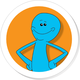 The finished product
activity_circular_profile_picture.xml
<?xml version="1.0" encoding="UTF-8"?>
<android.support.constraint.ConstraintLayout
   android:layout_width="match_parent"
   android:layout_height="match_parent">
   <RelativeLayout
      android:layout_width="fill_parent"
      android:layout_height="fill_parent"
      tools:layout_editor_absoluteX="0dp"
      tools:layout_editor_absoluteY="0dp">
      <FrameLayout
         android:layout_width="wrap_content"
         android:layout_height="wrap_content"
         android:gravity="center"
         android:background="@drawable/profile_picture_border"
         android:padding="8dp">
         <ImageView
            android:id="@+id/userProfileProfilePicture"
            android:layout_width="150dp"
            android:layout_height="150dp"
            android:layout_centerHorizontal="true" />
        </FrameLayout>
   </RelativeLayout>
</android.support.constraint.ConstraintLayout>
CircularProfilePictureActivity.java
public class CreateCircularProfilePicture extends Activity {
   private int MOBILE_DEVICE_DENSITY = 160; // Based on device
   private int DESIRED_IMAGE_WIDTH = 150;
   @Override
   protected void onCreate(Bundle savedInstanceState) {
      ImageView profilePicture = (ImageView)findViewById(R.id.userProfileProfilePicture);
      profilePicture.setImageDrawable(getUserProfilePictureDrawable(id));
   }
   public Drawable createCircularProfilePicture(Drawable image) {
      // Convert image from Drawable to Bitmap
      Bitmap bmp = BitmapFactory.decodeResource(this.getAppContext(), image);

      // Crop image into square
      int width = bmp.getWidth();
      int height = bmp.getHeight();
      int firstPixelX, firstPixelY;
      if (width > height) {
         firstPixelX = (width — height) / 2;
         firstPixelY = 0;
      }
      else {
         firstPixelX = 0;
         firstPixelY = (height — width) / 2;
      }
      bmp = Bitmap.createBitmap(bmp, firstPixelX, firstPixelY, bmp.getHeight(), bmp.getHeight());

      // Created rounded Drawable
      RoundedBitmapDrawable drawable = RoundedBitmapDrawableFactory.create(this.getResources(), bmp);
      drawable.setCornerRadius(150 * DENSITY);

      return drawable;
   }
}
profile_picture_border.xml
<?xml version="1.0" encoding="UTF-8"?><item> <shape xmlns:android="http://schemas.android.com/apk/res/android" android:shape="oval"> <gradient android:type="radial" android:gradientRadius="150dp" android:startColor="#7F333333" android:endColor="#00FFFFFF" /> <size android:height="150dp" android:width="150dp"/> </shape> </item> <item android:left="2dp" android:right="2dp" android:top="2dp" android:bottom="2dp"> <shape android:shape="oval"> <solid android:color="#FFFFFF"/> </shape> </item> </layer-list>
Implementing these circular profile pictures in React Native is much simpler.
First, one would need to define the image component; this can easily be done using React Native’s JSX syntax:
<Image
   source={profilePictureSrc}
/>
To shape the image into a circle in React Native, one simply uses the CSS border-radius attribute, setting this attribute to 50 % of the width/height of the shape:
<Image
   source={profilePictureSrc}
   style={{
      width: DESIRED_IMAGE_WIDTH,
      height: DESIRED_IMAGE_WIDTH,
      borderRadius: DESIRED_IMAGE_WIDTH / 2
   }}
/>
The border can also easily be appended as style attributes:
<Image
   source={profilePictureSrc}
   style={{
      width: DESIRED_IMAGE_WIDTH,
      height: DESIRED_IMAGE_WIDTH,
      borderRadius: DESIRED_IMAGE_WIDTH / 2,
      borderWidth: 5,
      borderColor: “#FFFFFF”
   }}
/>
In React Native, shadows are implemented via dedicated style attributes for shadow offsets, colours, and opacities. However, the shadow attributes are only available to certain components such as the View component. Thus, we have to wrap the image component in a view component before using these styles.
There is a known issue in which the style shadow attributes are not successfully applied for certain Android devices. A current workaround for this issue involves using the elevation style attribute for container View component. However, similar to using the elevation attribute in native Android development, developers will not be able to customize the shadows.
<View
   style={{
      borderRadius: DESIRED_IMAGE_WIDTH / 2,
      shadowOffset: {
         width: 1, height: 1
      },
      shadowColor: “#333333”,
      shadowOpacity: 0.5
   }}>
   <Image
      source={profilePictureSrc}
      style={{
         width: DESIRED_IMAGE_WIDTH,
         height: DESIRED_IMAGE_WIDTH,
         borderRadius: DESIRED_IMAGE_WIDTH / 2,
         borderWidth: 5,
         borderColor: “#FFFFFF”
      }} />
</View>
And that’s it!
CircularProfilePicture.js
export default class CircularProfilePicture extends React.Component {
   render() {
      const DESIRED_IMAGE_WIDTH = 150;
      return (
        <View
            style={{
               borderRadius: DESIRED_IMAGE_WIDTH / 2,
               shadowOffset: {
                  width: 1, height: 1
               },
               shadowColor: “#333333”,
               shadowOpacity: 0.5
            }}>
            <Image
               source={profilePictureSrc}
               style={{
                  width: DESIRED_IMAGE_WIDTH,
                  height: DESIRED_IMAGE_WIDTH,
                  borderRadius: DESIRED_IMAGE_WIDTH / 2,
                  borderWidth: 5,
                  borderColor: “#FFFFFF”
               }} />
         </View>
      );
   }
}
 An interesting benefit of using circles to display profile pictures…
Overall, implementing circular profile pictures in native Android code is significantly more complex than when using React Native. There are obviously many reasons why one would still use native Android over React Native when developing their projects. However, if you ever wish to quickly hack up a circular profile picture in a small project, I would definitely recommend using React Native.